Our expert digital consultants and user experience (UX and UI) designers have been behind websites and e-commerce sites that have transformed how shoppers shop and travellers book, as well as developing innovative payments and banking applications for banks, fintech start-ups and challenger banks.
As a leading London-based digital agency with a background in brand strategy and design, our designers design award-winning brand experiences for users of every type of device, interpreting compelling brand propositions into engaging digital experiences with effective calls to action and high conversion rates.
We design and build websites and apps to meet user's need for frictionless ecommerce in travel, banking and finance and luxury, as well as informational marketing and corporate websites. Our clients range from global corporations to start ups, but they share a desire for their brands to be digital leaders in their fields.
Hotel website design specialists
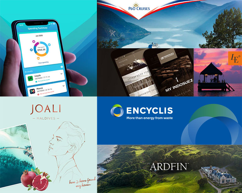
One area of specialism is hotel website design, where we have unmatched experience, having worked with a wide range of hotel, tour operator and travel agency brands over the past 25 years, in both mass market and luxury travel sectors, winning many awards in the process. We have worked for P&O Cruises and the Camping & Caravan Club for over a decade and for luxury hotel groups we have designed award winning travel websites for many of the leading brands, from Aman to Zulal and most recently for Stademos Hotels and The Potlatch Club. We often work on integrated brand and digital projects, but our expertise also extends to booking flows, marketing automation, CRM integration, digital marketing and SEO.
While more and more hotel websites look the same, we specialise in bespoke website design, interpreting the very essence of the brand, whether a unique individual property like Ardfin, or small or large group of hotels like Joali, looking to differentiate our client's brand from their competitors, while delivering a seamless online search and booking process to grow direct bookings.
Unlike any of our peers, we also practice what we preach, running our own luxury travel portal, Luxury Explorer, where we can draw upon our direct commercial experience of running an OTA wwith access to a network of talented contributing travel editors for creative copywriting.
Award-winning bespoke user experience design
What differentiates Nucleus from many other digital agencies is our commitment to bespoke user experience design. Our UX designers analyse audience requirements and map user journeys in great detail before designing information architectures that will support all the priority user requirements. At this time we also identify the content requirements and keywords that will drive the right traffic to each page, with calls to action (CTAs) position to convert interest into enquiries, bookings or online sales.
With wireframe prototypes built to test the usability of the UX designs, our UI designers then bring the website brand to life across all types of device, using Figma prototypes to illustrate the look and feel and sample content. Photos, video and animation are all used where appropriate to communicate the website's value proposition, while progressive loading, parallax scrolling and type animation all combine to create an immersive, interactive user experience.
With a team of designers and front-end developers who have worked together over many years, we are able to deliver the award-winning website user experiences that combine precision and fluidity, always focussed on communicating the proposition and converting interest into action.
We follow a similar approach with app development, where we have designed banking apps for retail banks, wealth managers and fintech start-ups, as well as travel apps for ticketless transport solutions.
Digital Agency .Net CMS Specialists
We are specialists in .Net content management systems, including Kentico, Umbraco, EPiServer and SiteCore, using MVC and AMP web component frameworks to ensure superfast loading across all devices. All our websites are responsive, based on a lonng-held mobile-first philosophy.
Nucleus is an Umbraco and Kentico Partner, having designed and built more than 30 Umbraco and 40 Kentico CMS websites and apps. We have considerable recent experience using Umbraco Cloud.
For travel websites, we have deep experience designing and integrating reservations systems, including smart booking widgets and SynXis, TravelClick and ResortSuite customisations. With several of our own digital ventures behind us, our technical team also understands the day-to-day challenges of operating digital businesses, including performance optimisation, business continuity, security and continuous improvement.
We have worked in eCommerce for more than 25 years developing many platforms, ranging from enterprise ecommerce systems to customising popular platforms like Shopify.
AGILE APP AND WESITE DEVELOPMENT
As a marketing-led digital agency we are focused on achieving rapid business objectives. We have fully embraced agile development, especially for apps, where projects are divided into iterative mini-projects from design to development, testing and delivery. Rapidly launching a minimum viable product (MVP) and then incrementally releasing richer functionality is second nature to our teams.
Launch and post-launch
Following go-live we work with third party digital marketing agencies, but also support our own SEO and emarketing strategies. Many of our clients trust us to deliver their SEO objectives annd we have a wide range of sophisticated tools to help us conntinuously optimise websites for search traffic.
We also host and manage a dozen or more travel and marketing websites, ranging from hotel sites to tour operators and financial services brands, so we have valuable practical operational experience of 24/7 e-commerce businesses, hosting them in our own secure cloud or on Microsoft Azure.
In today's data economy, security and compliance with the regulatory environment around the world is also of paramount importance. We work with our clients on data strategies and GDPR compliance and also offer technical advisory services, including customer profile management automation.
Please contact us for more detailed information about our digital design and development services.
Our digital agency technical services
- Technical audits and advisory
- GDPR and data security services
- Functional requirements and specifications
- UX design
- Wireframing
- UI design
- Figma prototyping
- Technical architecture and design
- Vendor evaluations
- Responsive front-end HTML5
- CMS configuration and integration
- Booking system customisation and integration
- eCommerce implementation and integration
- Testing - client side, back-end, security and cross-browser
- Webhosting (data centre, private cloud and Azure)
Our digital agency delivery technologies
- HTML 5
- .Net/C#
- Javascript and JQuery library
- CSS 3
- E-commerce platforms, including customising Shopify
- CMS - Umbraco, Umbraco Cloud, Episerver, Kentico, Sitecore, Tridion


- CRM - Salesforce, Emarsys, Silverpop (now part of IBM Watson Marketing), Gigya


- Booking systems - SynXis, ResortSuite, Tigerbay, Opera (now part of Oracle Hospitality), Pegasus, Extrali